Spring Grove Revisited – with Lomo Turquoise Film and Digital Infrared
Lomochrome Turquoise 35mm - image courtesy of Lomography.
Recently I purchased a box full of random film stocks, and among all the Arista and Chinese films in the box was a 35mm roll of Lomography’s Lomochrome Turquoise. I’ve been outspoken in the past about “gimmicky” films and haven’t had much of a desire to try them out. Staring at the roll of Turquoise, I remembered that its often compared to the look you get when shooting infrared. Hey, I shoot infrared. That is kind of gimmicky. Hmmm. Instead of throwing stones from my glass house, I should probably step outside of it and shoot the Lomo Turquoise.
First, what is Lomochrome Turquoise? It’s what is commonly referred to as a “false-color” film. What this means is that there is a non-complimentary relationship between an emulsion layer and the color of light it’s sensitive to. This is achieved with dyes on the emulsion that are different than anticipated for the layer that they are applied to. In the case of Lomo Turquoise; blue colors result in red/orange hues, while red/orange colors result in blue hues. Green is the least affected, as it renders as turquoise. If you want to read more in-depth about the color shifts that it creates, Lomo has a great article on their website with images here.
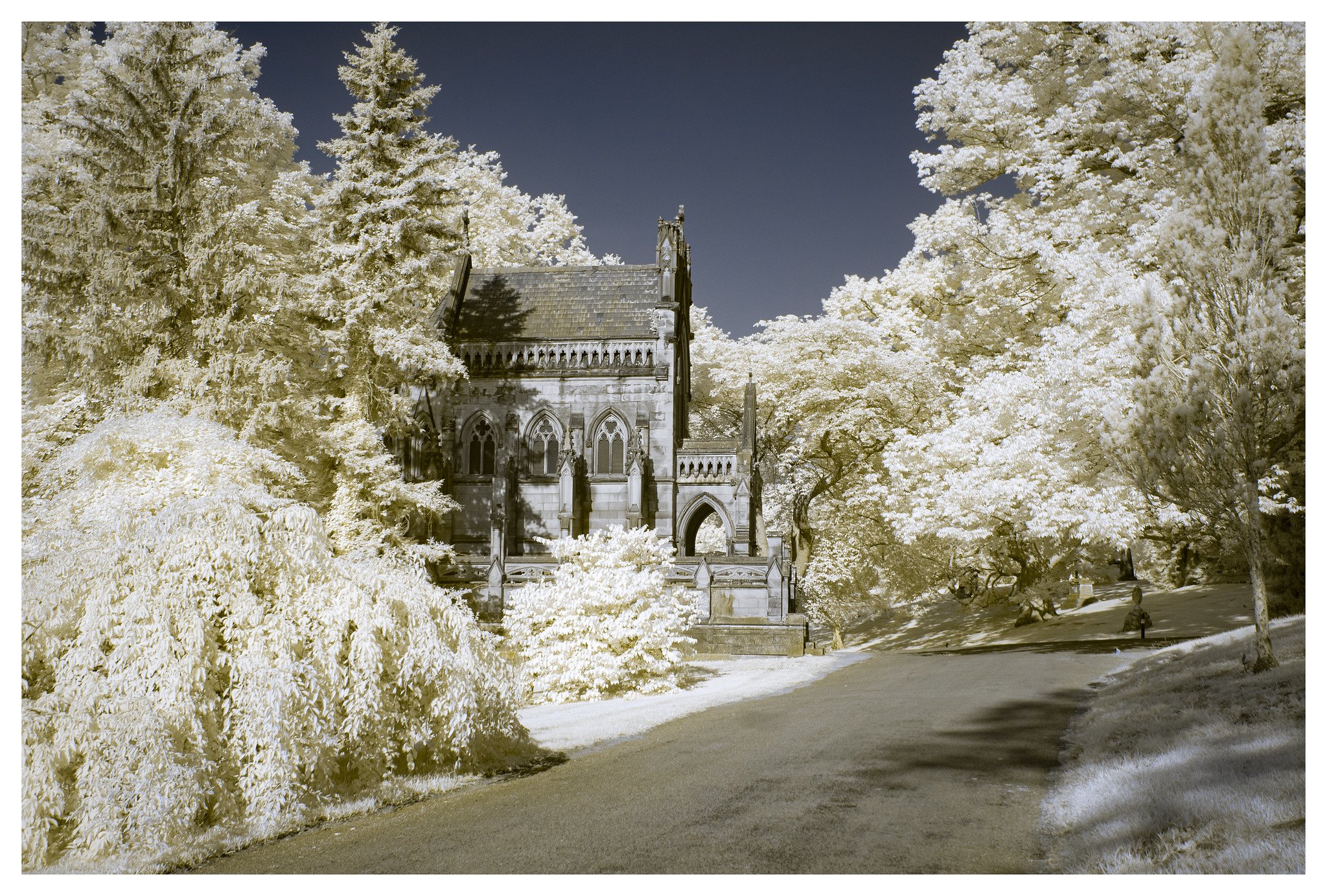
Last Fall I visited Spring Grove Cemetery and came away with a lot of infrared shots from that day that I really liked. Thinking that it would be great to get back there during the early Summer when everything is truly green and leaves aren’t already starting to turn, I headed down there on an early Saturday morning with my 720nm-converted Infrared Nikon D2x, and my Nikon F100 loaded with the roll of Lomo Turquoise.
First, before I get to the images, I should state that this isn’t a “test” of Turquoise versus IR. There will be not charts, graphs, or science here. It’s just my initial thoughts of the film, and what it’s like to shoot alongside similar IR images. Both choices yield looks that can be fantasy-like or other-worldly. Also know that I have a “recipe” for processing my IR images that has taken me a long while to perfect to get the look that I want – with light gold foliage and inky blue skies. This involves more than just swapping the red and blue channels, which is the most common way to edit IR color images.
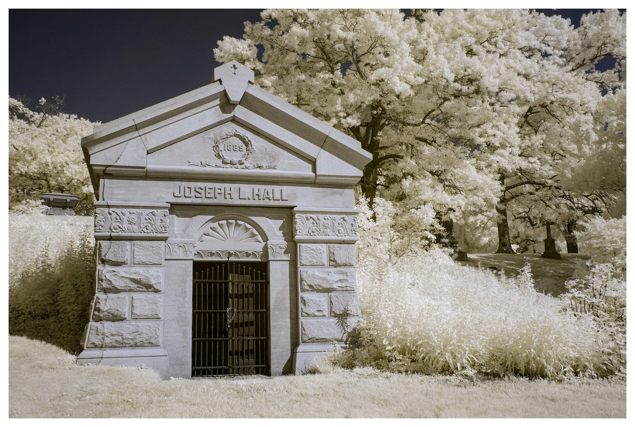
OK, enough said, let’s get into it. The images with white borders are Infrared, while the images with black borders are Lomo Turquoise. All were shot at f/8 and varying shutter speeds. Click on the images to open in a new window where you can scroll and compare.


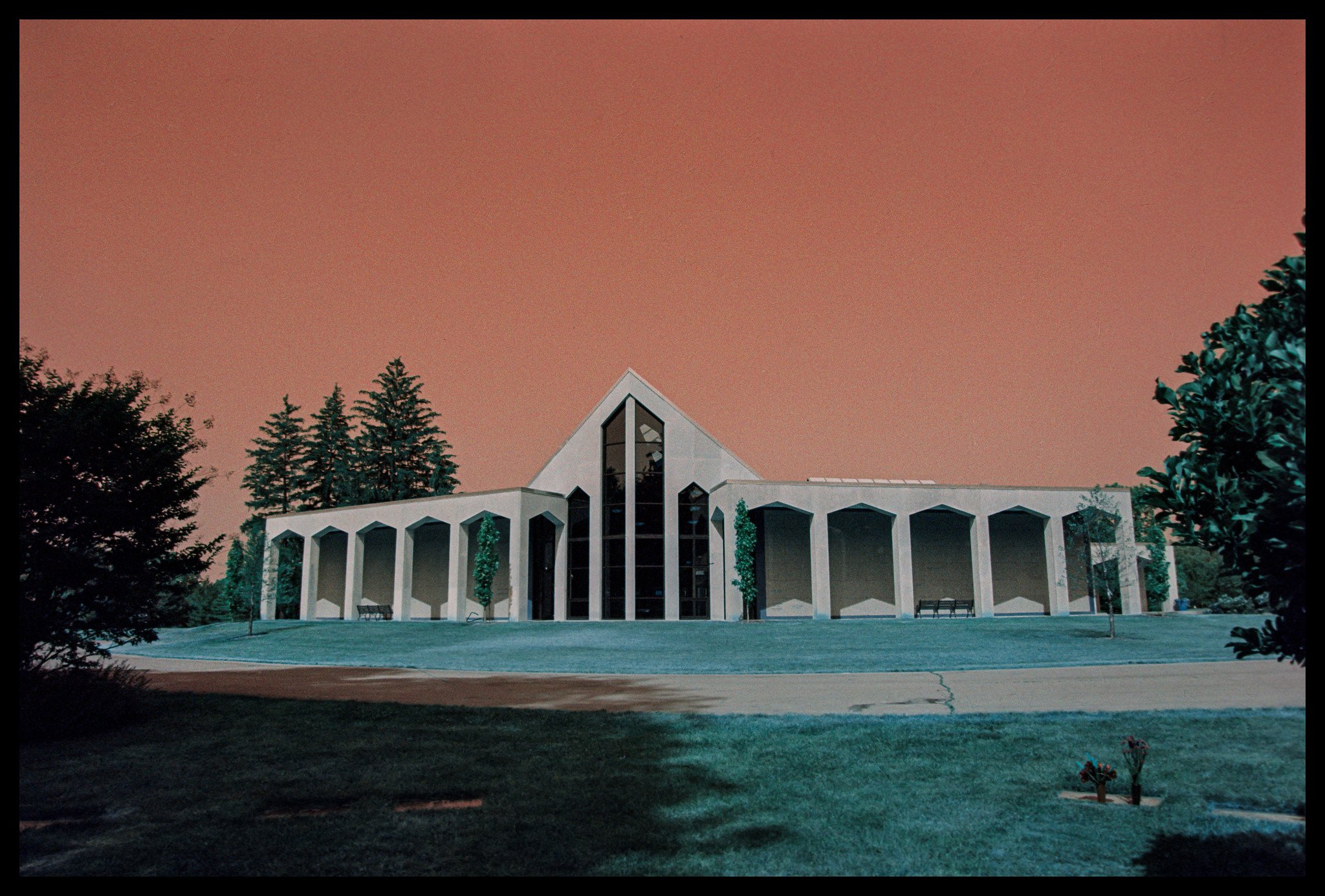
I rated the Lomo film at ISO 200 for the day. It was a bright, sunny cloudless morning so speed wasn’t a worry, especially with the 24-70mm f/2.8 VR lens on the F100. Lomo says it’s a “variable ISO” film that can be shot anywhere from 100-400 for different looks. I thought that 200 would be a good compromise right down the middle, but after looking at the results I think its slightly underexposed, especially in the vegetation and the shadows. I think its maybe ½ stop to a full stop under. I tried bringing it up in editing, but the film is grainy for what it is, so it instantly became a mess trying to raise the exposure after the fact. I think the next time I’d shoot this at ISO 100.
That said, the Turquoise does make for an interesting rendering of the scene. That color in the vegetation is crazy, and the sky looks like something you’d expect to see in a movie with Patrick Swayze and his Wolverines fighting the Russians.
I’m happy with the IR image here. Last year when I took this shot the tree on the right had already dropped most of its leaves. Not this time! IR really shows off the contrast between the building and the vegetation and sets it off for me.
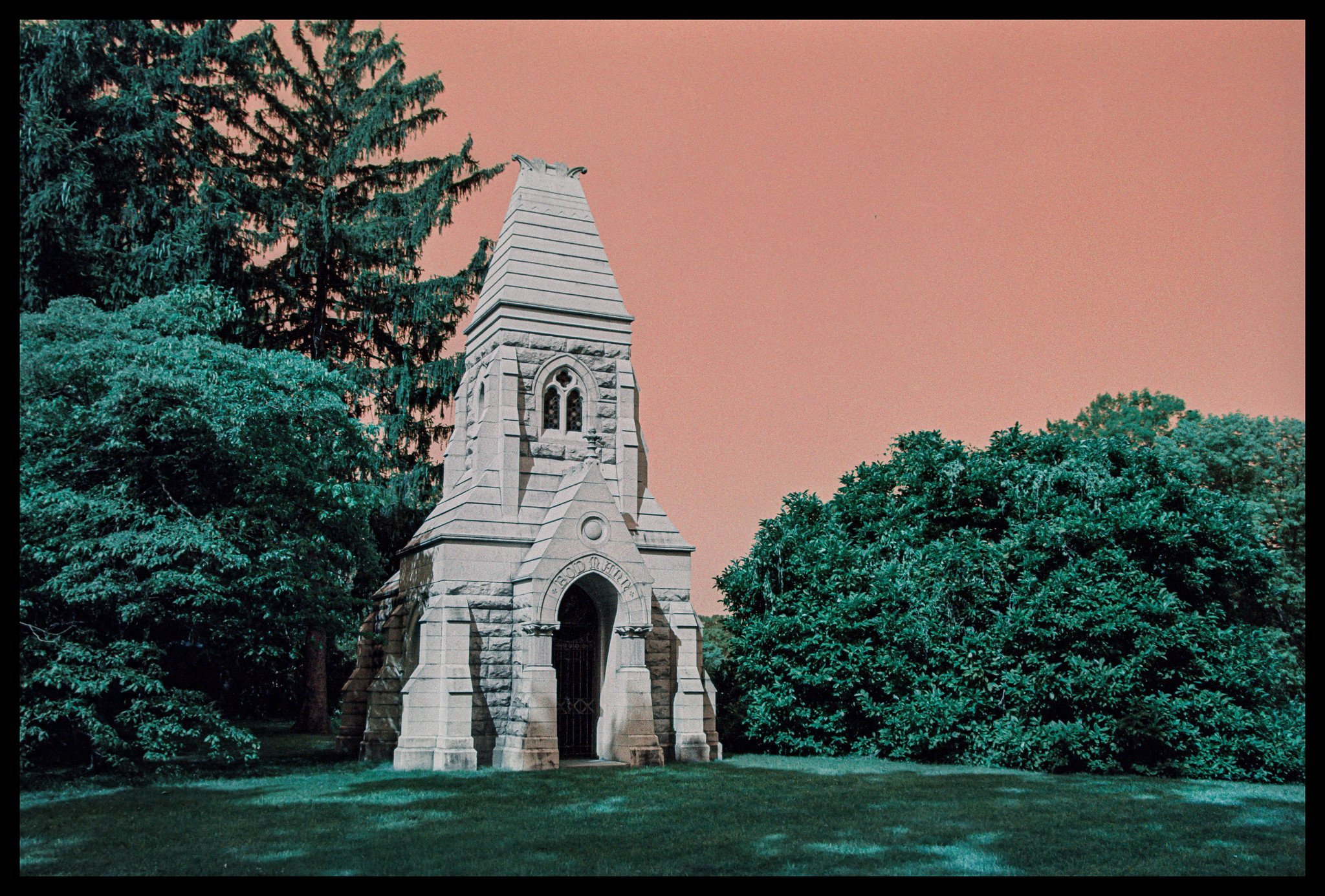

Despite it feeling a little underexposed in the vegetation, I really like the look it gives the sky. The red/orange look is almost apocalyptic, and in the right settings could really add to an image. I’ve read reviews that say that the red sky look is more intense when shot at ISO 400 and wanes when shot at 100. I’ll have to experiment with that the next time I shoot. I’m not certain I want the trade-off of underexposed foliage and shadows for a more intense sky, but maybe a graduated ND filter could get me there.
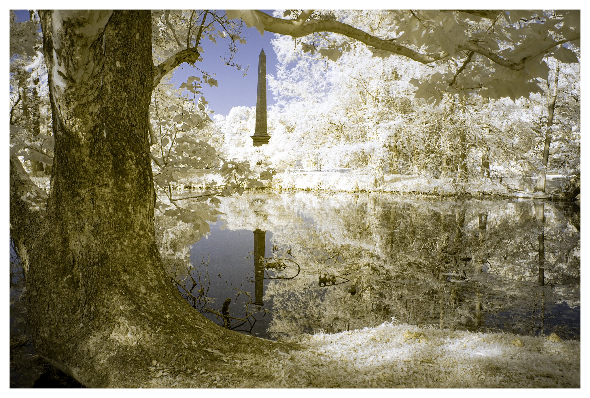
With no clouds in the sky, the IR image really gives the sky some drama. Maybe a few clouds would have been better that day to add a little more visual interest to the sky, but then the light just may not have been as good for IR.


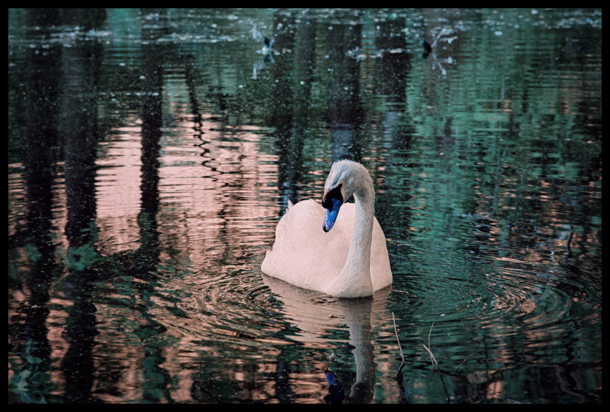
While the two shots above aren’t exactly from the same spot, it is interesting to see the difference in what IR sees and what the Turquoise film picks up. The alliums in front of the building are nearly impossible to see in the IR image, while they really pop in the Turquoise image. I also like the reflection of the building in the Turquoise image better, as it stands off against the darker foliage compared to the IR image.
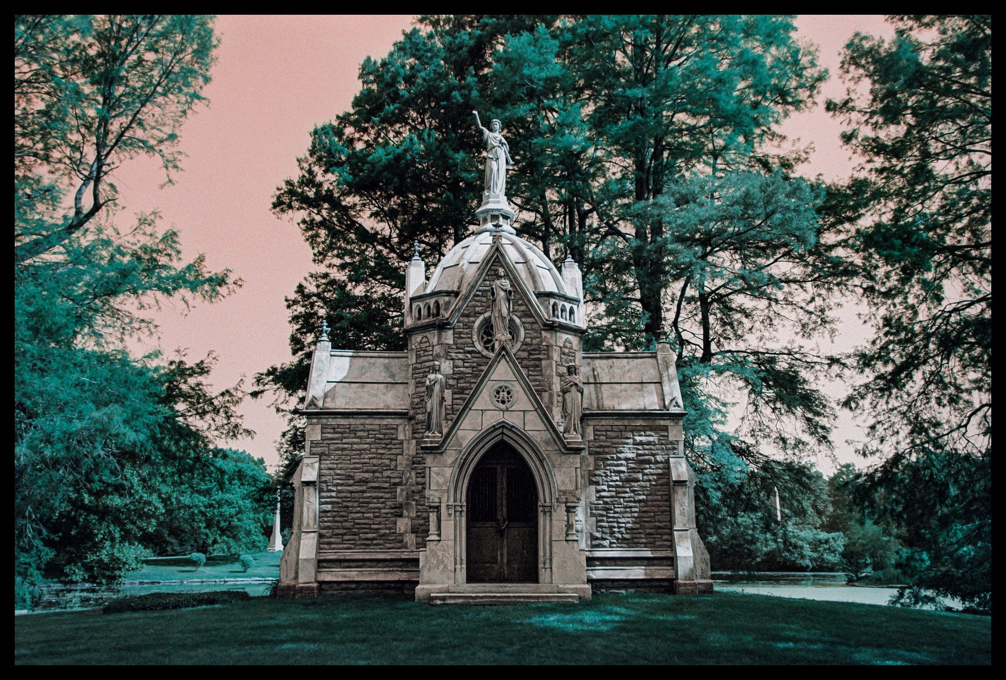

At first glance I greatly preferred the IR image when I was processing the two images above, but the more I stare at the Turquoise image, the more I like it for different reasons. The building does pop nicely against the foliage, and that orange/red sky really ads something. It’s just separated enough from reality to be interesting.
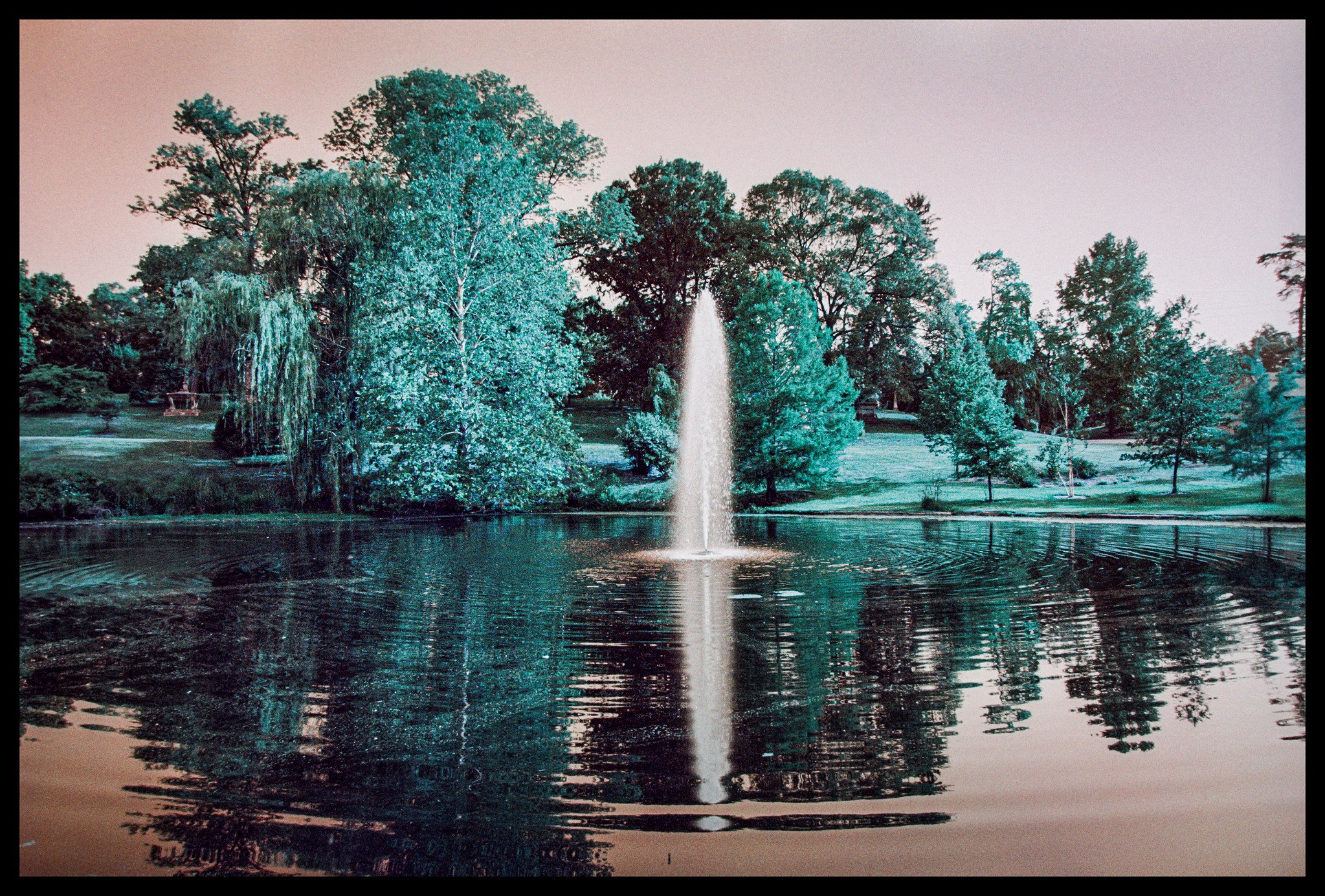
Below is a gallery of more IR and Turquoise shots from the day. I spent almost 4 hours in Spring Grove and probably walked about 5-6 miles total. And I didn’t even really see all of it.


So, what do I think about Lomo Turquoise now that I’ve shot a roll and have had some time to digest the images?
Yes, its gimmicky. But not in a bad way. Honestly, no gimmickier than shooting infrared color. It does have a certain look to it that can mix things up a bit and might get someone out of a “rut” of shooting the same thing or same look all the time. I will say that IR gives a little more flexibility regarding processing in either color or B&W, and the number of different looks that you can get with channel swaps. But that’s a bit of an unfair “digital versus film” comparison.
It’s grainy. Maybe too grainy for my liking. I normally like some film grain, as its part of the charm of shooting film. Grain can also add perceived sharpness to an image, at least to a certain point. That said, I don’t like the grain of Turquoise. It just looks like improperly exposed film or expired film to me. I think that’s mainly due to me shooting it at 200 when it probably is happiest at 100 in terms of exposure/grain. Before I cast final judgment on this aspect, I will shoot another roll at 100 instead and re-evaluate then. It also *may* be better in 120 versus the 35mm roll that I shot.
It's given me some ideas. I’d like to shoot this film again, in 120. I’m hoping the grain isn’t so bad on the larger film stock and am interested in what it looks like in medium format. I think it could really be interesting for some night-time long exposures. Blue hour photography could take on a whole new meaning – “Orange Hour” photography maybe? A brilliant orange/red sunrise/sunset could be very interesting and dramatic with this film. I’m also curious as to how a circular polarizer may enhance the shifted colors of the film.
It caused me to place an order with Lomography. I ordered more of it in both 35mm and 120 to experiment with. And if Turquoise isn’t so bad, what about the other weird, gimmicky films? Yep, I also picked up some Metropolis and some Lomo Purple. I know, I know. The last thing I needed is MORE film, but hey, it’s not your money. Don’t lecture me.
So yes, Turquoise changed my mind about Lomo films. It’s not a film stock that I would grab to take photos of people or anything that I would want rendered as “normal”, but it’s a nice film to have in my arsenal. The random chance encounter with it because it was in a box of other film was, I guess, serendipity. What other films out there do I need to try? This could prove to be very dangerous for my wallet, and my already burgeoning film refrigerator.
Have you shot Lomo Turquoise? What are your thoughts on it? If not, are you interested in giving it a try now? Please comment below, and as always, thanks for reading!
Jeremy